Marketplace Redesign
Redesigning the investment gateway for a platform that had outgrown its original design.

I was a Product Designer on the Yieldstreet Marketplace redesign, now Willow Wealth. The marketplace was the gateway for all investments on the platform, and it was struggling to keep up.
Skills
User Research
User Interviews
A/B Testing
Design Audit
Wireframing
Prototyping
Testing
My Role
Product Designer
Timeline
Q3 2022 - Q4 2022
Overview
The Yieldstreet marketplace was the central hub where investors discovered, compared, and accessed all available investment offerings. As the platform grew and the number of offerings increased, the original design, built for a much smaller catalogue, started to buckle under the weight.
Highlights
8%
Increase in conversion rate
78%
Increase in filter usage
12%
Increase in investment views
42%
Increase in average time on page
Problem
The original marketplace was built for a smaller platform.
We started with user interviews and usability testing with real investors to understand where the experience was breaking down. The feedback was consistent across sessions: the marketplace had become difficult to use as the volume of offerings grew, and investors were struggling to find and compare what was available.
What we found
Overwhelming layout
Too much information on the page with no clear hierarchy. Investors didn't know where to focus.
Excessive scrolling
The stacked card format meant investors had to scroll through everything to see what was available. Nothing could be compared at a glance.
No way to compare
There was no mechanism for comparing offerings side by side, making it hard to make an informed decision.
Ineffective filters
The only filter available was investment strategy. Investors couldn't narrow by asset class, minimum investment, term, or any other criteria they actually used to make decisions.
Poor information hierarchy
Key details were not consistently surfaced. Some investors felt information was missing, others felt there was too much.

Insight
To address these issues, we employed a "How might we" framework to generate open-ended questions that would guide our design process. This approach fostered creative thinking and allowed us to explore a variety of solutions for improving the user experience. Our key questions included:
How might we…
Improve the layout of the marketplace to make it less overwhelming?
Enable investors to easily compare different offerings?
Enhance the filtering functionality to help investors narrow down their options?
Prioritise the information presented on the marketplace to make it more relevant and easier to find?
Streamline content to remove unnecessary information and make it more efficient for investors?
Address the issue of long scrolling on the page?
Create a more intuitive and user-friendly marketplace experience for investors?

Establishing the Hypothesis
The research pointed to one core problem: the marketplace was designed around a list of offerings, not around how investors actually make decisions. They don't scroll linearly through a catalogue. They filter, scan, compare, and then commit. The redesign needed to support that pattern, not fight it.
Hypothesis
If we shift from a stacked list to a scannable grid, improve filtering, and surface the right information on each card, investors will find and compare offerings faster and convert at a higher rate.
The redesign focused on four elements: the hero banner, the filter system, the offering card, and the overall page layout. Each one was addressed directly based on what the research surfaced.
Explorations
Getting the structure right before the details
Given the marketplace's importance to the business, we ran a broad low-fidelity wireframing phase before committing to any direction. We involved the key stakeholders early, running multiple sessions to share concepts and pressure-test assumptions. The goal was to make sure the structural decisions were right before investing in high-fidelity design.


Solution
The redesign addressed four distinct components of the marketplace. Each one mapped directly to a pain point from the research.

Hero Banner
The original hero banner was plain and passive. It failed to communicate the platform's credibility or give new investors a reason to engage. The redesign added social proof, key platform metrics, and clear calls to action. Investors arriving at the marketplace for the first time now see immediately why Yieldstreet is trusted and what they can do.

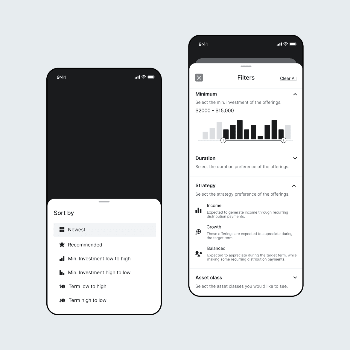
Filters
The original filter system offered a single option: investment strategy. It was effectively useless for any investor trying to narrow the catalogue by what actually mattered to them. The redesigned filter system introduced asset class, strategy, minimum investment, and term, plus a sort feature for criteria including newest, minimum investment, and term. The 78% increase in filter usage confirmed that investors were looking for exactly this control.


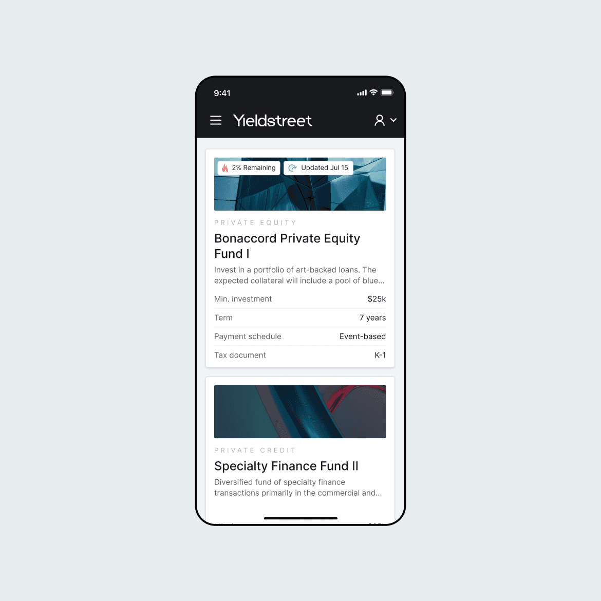
Offering Card
The offering card was the most complex design challenge. The original full-width stacked format had worked when the catalogue was small, but became unnavigable as offerings grew. We tested multiple card formats and information hierarchies before landing on a grid layout that prioritised the metrics investors actually used to evaluate opportunities. The reduced card size required careful decisions about what to show and what to defer to the offering detail page. Multiple rounds of internal and external testing validated the final hierarchy.


Page Layout
Moving from a stacked list to a grid layout was the single biggest structural change. It reduced the amount of scrolling required to see the full catalogue and made the page scannable rather than linear. Combined with the improved filter system, investors could now narrow to a relevant subset of offerings and compare them visually without losing context.

Impact
The redesign launched in Q4 2022. All five metrics moved in the right direction, with filter usage and time on page showing the most dramatic improvements.
Highlights
8%
Increase in conversion rate
More investors who landed on the marketplace completed an investment. Better information hierarchy and a cleaner flow removed the friction between browsing and committing.
78%
Increase in filter usage
Investors immediately adopted the new filtering tools. The original single filter was barely used, confirming that the lack of options was a genuine barrier, not an intentional design.
12%
Increase in investment views
With a grid layout and better filters, investors explored more of the catalogue. They found offerings they would previously have missed or given up looking for.
42%
Increase in average time on page
Investors spent more time exploring, comparing, and evaluating. The marketplace became a tool for decision-making, not just a list to scroll past.