Willow Wealth App
Rebuilding a mobile investment app that investors actually wanted to use.
I was the Product Designer on the Willow Wealth mobile app redesign. Willow Wealth, formerly Yieldstreet, connects investors with alternative assets. I worked with a team of engineers to rebuild the mobile experience from the ground up.
Skills
User Research
User Interviews
Design Audit
Design System
Prototyping
Testing
My Role
Product Designer
Timeline
Q2 2025 - Q3 2025
Overview
Willow Wealth gives investors access to alternative asset classes, including real estate, private credit, and structured notes, that were historically only available to institutions. The web platform was the primary experience, but investors increasingly wanted to monitor and transact on the go.
Highlights
78%
Boost in user engagement
16%
improvement in mobile app investments
60s -> 1s
Load times and big increase in app performance

Problem
The mobile app was losing investors before they even got started.
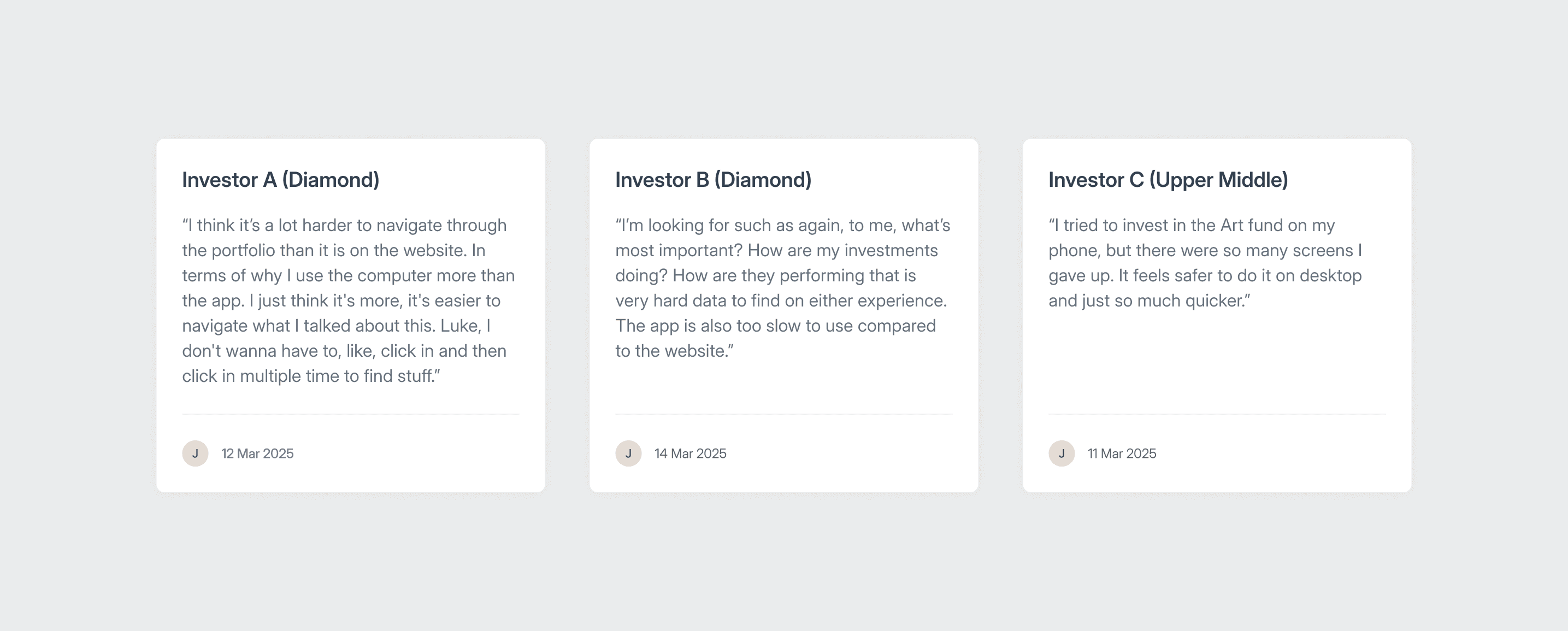
The web platform was the primary channel, accounting for 90% of usage. The mobile app sat at 8%, with the remaining 2% on responsive web. That 8% mattered though: it represented the investors who wanted to check their portfolio or make a move while away from their desk, and the app was failing them. We analysed user behaviour, reviewed internal technical assessments, and ran focused interviews with investors through the client relations team to understand exactly why.
What we found
Performance failure
Load times reached up to 90 seconds for large portfolios. Frequent errors on top of that meant users gave up and switched to the website.
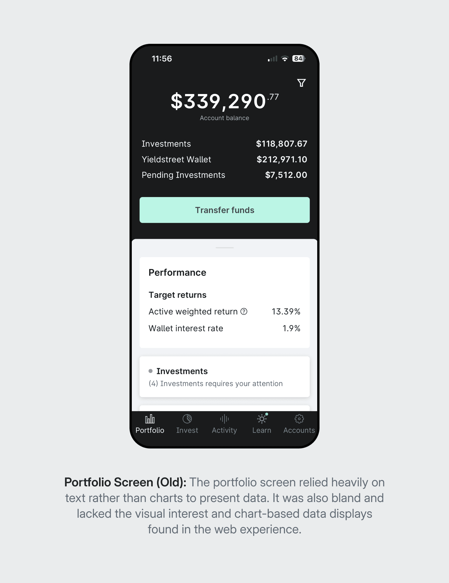
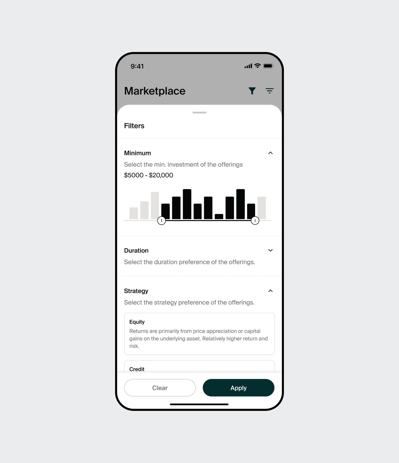
Poor information hierarchy
Portfolio performance data, the primary reason people opened the app, was buried. Users had to hunt for the numbers they came to see.
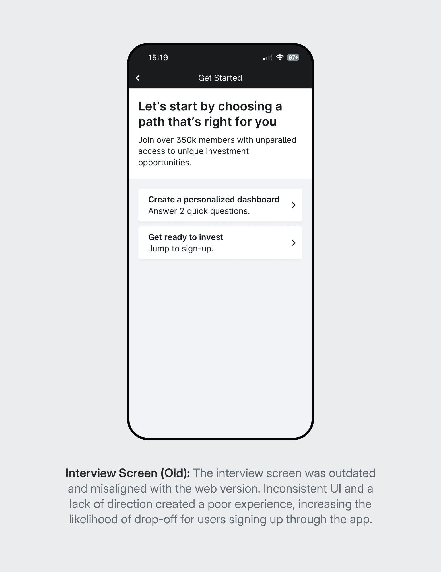
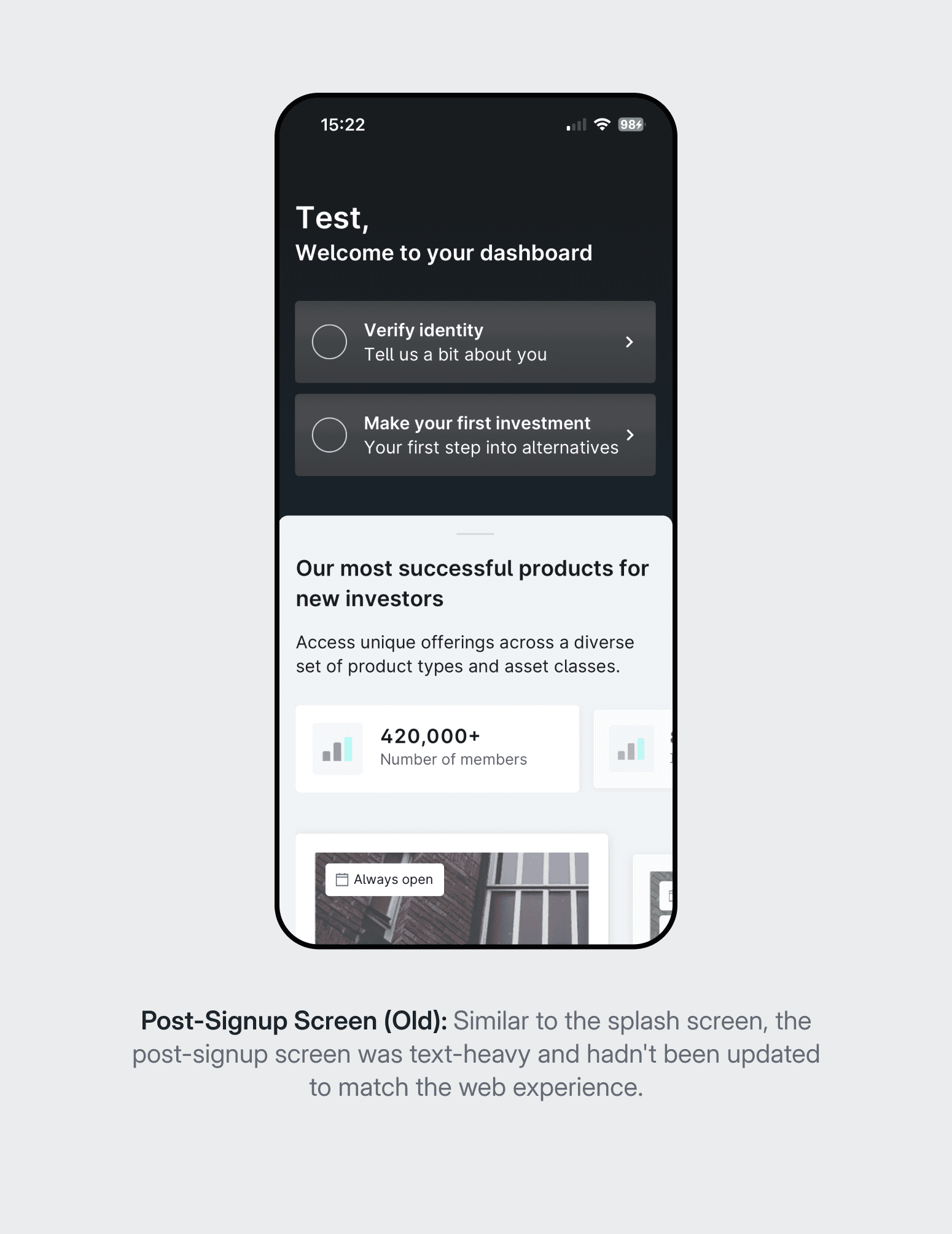
Inconsistent experience
The app's flows and visual language differed significantly from the web platform. Investors who used both had to learn two separate interfaces.
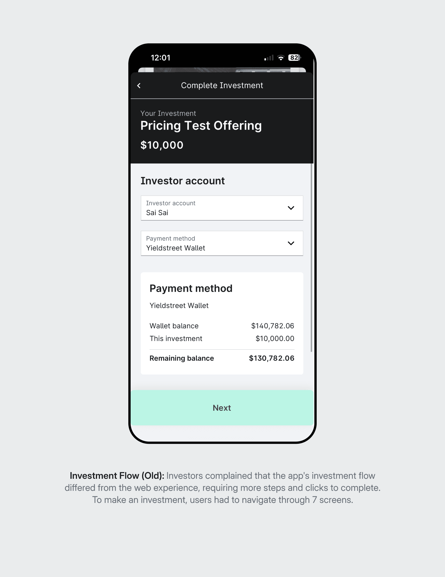
High-friction investment flow
The checkout process involved five steps, excessive scrolling, and too much text. Investors abandoned it in favour of completing transactions on the web.
Technical debt
The existing framework made it slow and costly to ship updates. Engineering changes that should have taken days were taking weeks.

Market Analysis
Before defining the direction, we studied how leading fintech apps handled the same challenges: complex data on small screens, high-stakes transactions, and the need to build trust at every step. The analysis focused on three areas: onboarding, dashboard presentation, and investment flows. The findings fed directly into the visual direction and the decisions around information hierarchy.
Establishing the Hypothesis.
The research pointed to two compounding problems: a broken technical foundation and an experience that didn't respect the investor's time. Fixing one without the other wouldn't move the needle. The strategy was to rebuild both simultaneously, using the migration to React Native Paper as the opportunity to unify the mobile and web experience properly.
Hypothesis
If we fix the performance and align the mobile experience with the web platform, investors will use the app as a primary tool, not a fallback.
Success was defined by two metrics: monthly active user engagement and mobile investment completion rate. Both required solving different problems. Engagement needed a dashboard users actually wanted to open. Completion needed a checkout flow that didn't make investors abandon to the website.
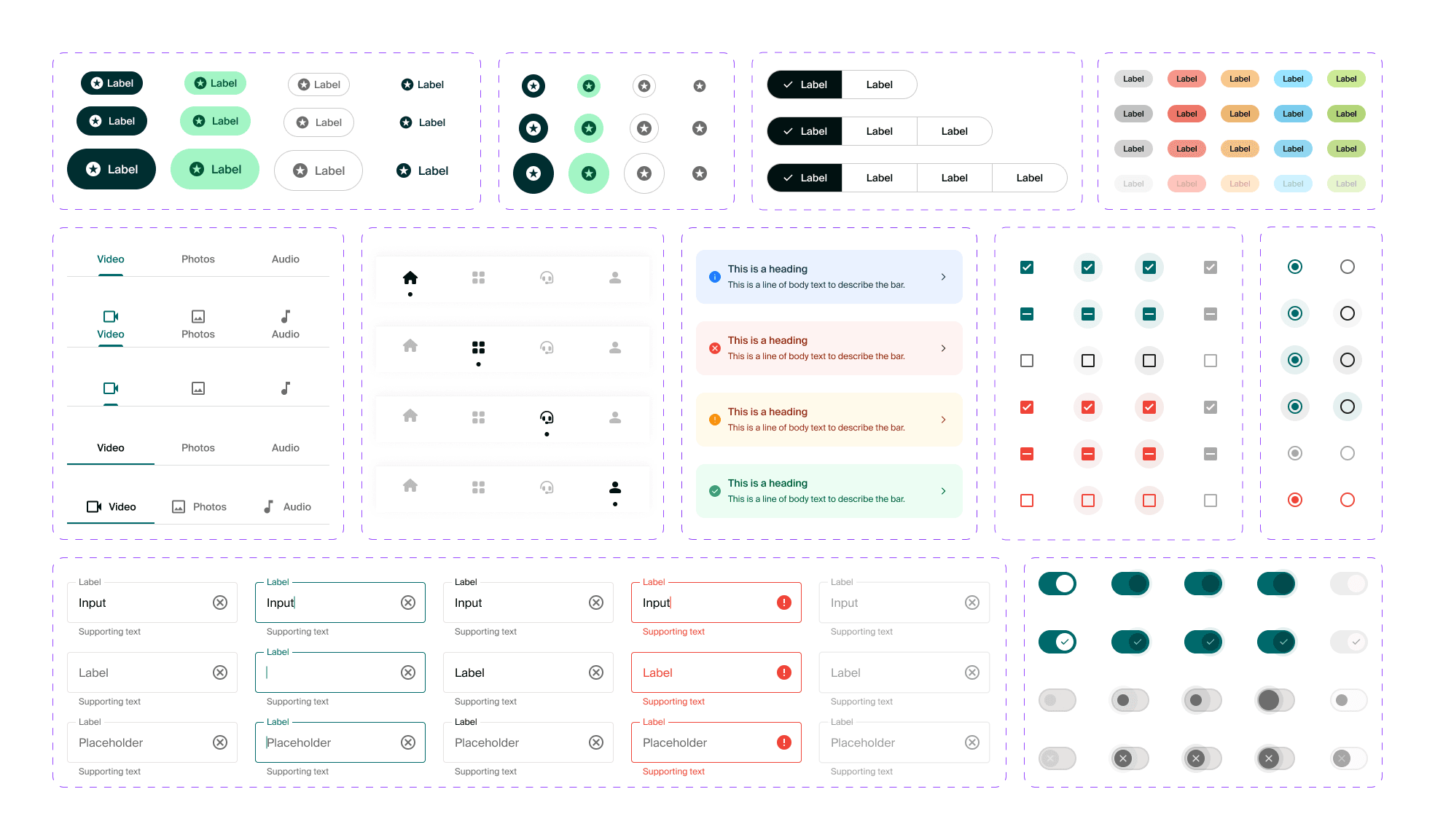
Design System
The engineering team selected React Native Paper, based on Material Design 3, as the technical foundation. It enabled a faster build and reliable performance. The design challenge was to prevent the app from feeling like a generic template while still leveraging the speed of the library.
Theming
Core tokens, including typography, colour palettes, and corner roundness, were overridden to align strictly with the Willow Wealth web aesthetic.
Custom components
Bespoke components were designed and built for complex financial data displays that the standard library didn't support, including portfolio charts and asset allocation visualisations.
Brand alignment
The code was React Native, but the feel was unmistakably Willow Wealth. Consistency with the web platform was the benchmark at every step.
Solution
The initial release focused on the highest-impact areas: onboarding, portfolio monitoring, and investment execution. Each one directly addressed a failure point from the original app.
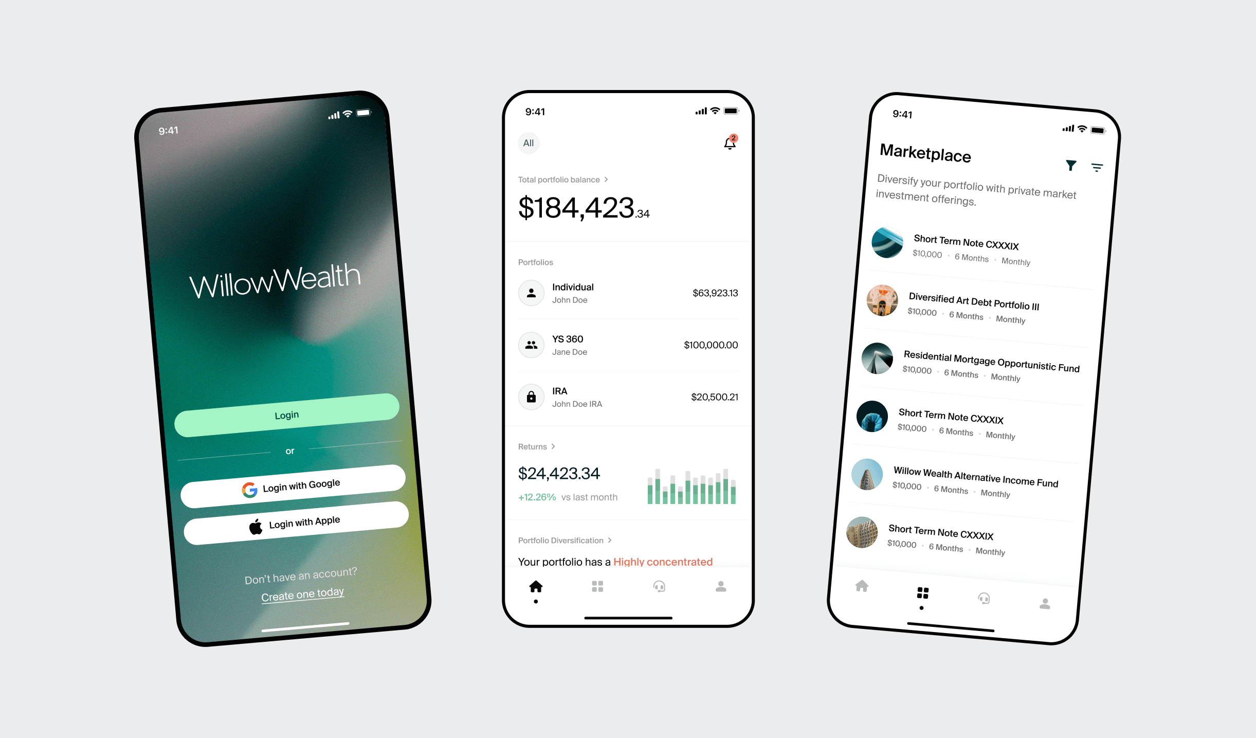
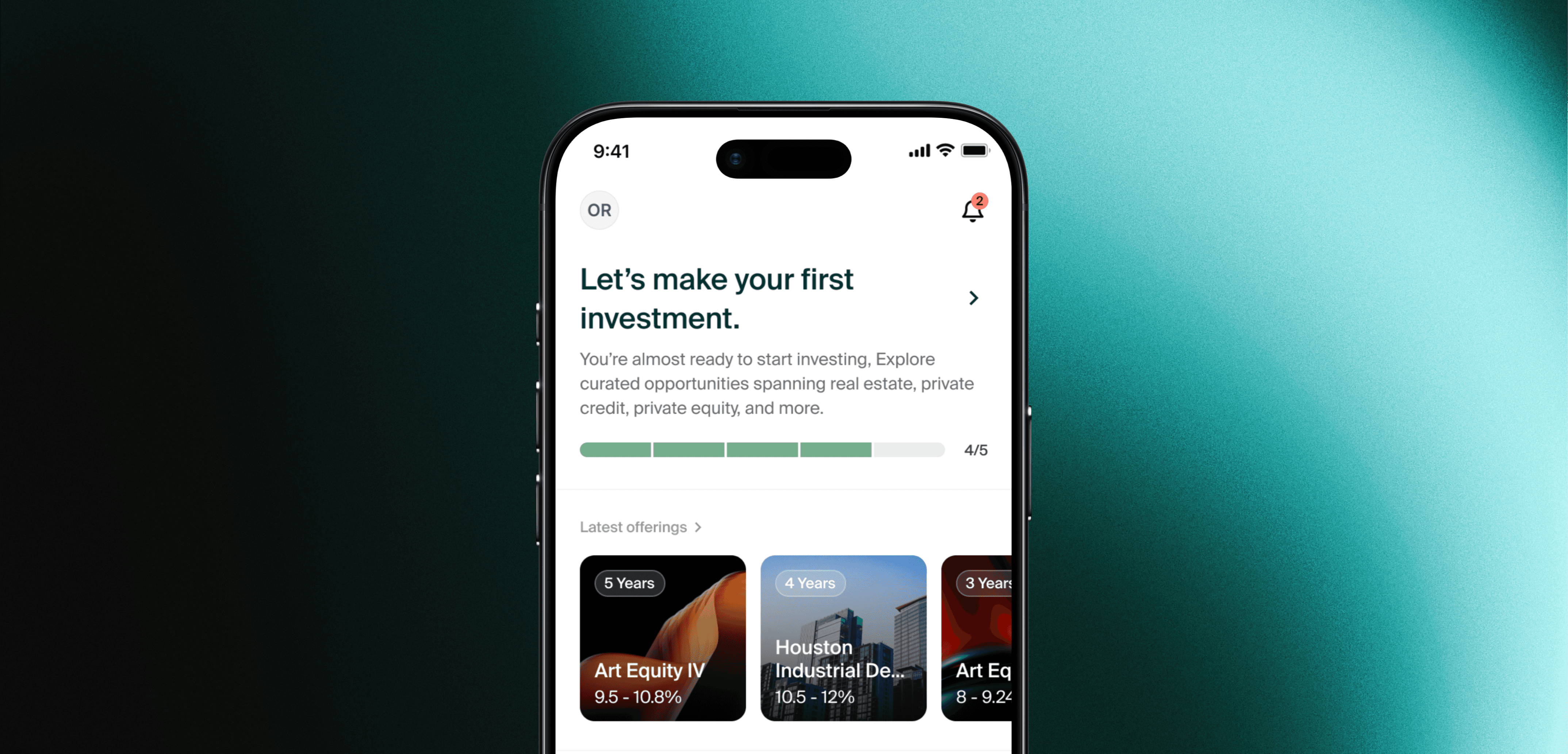
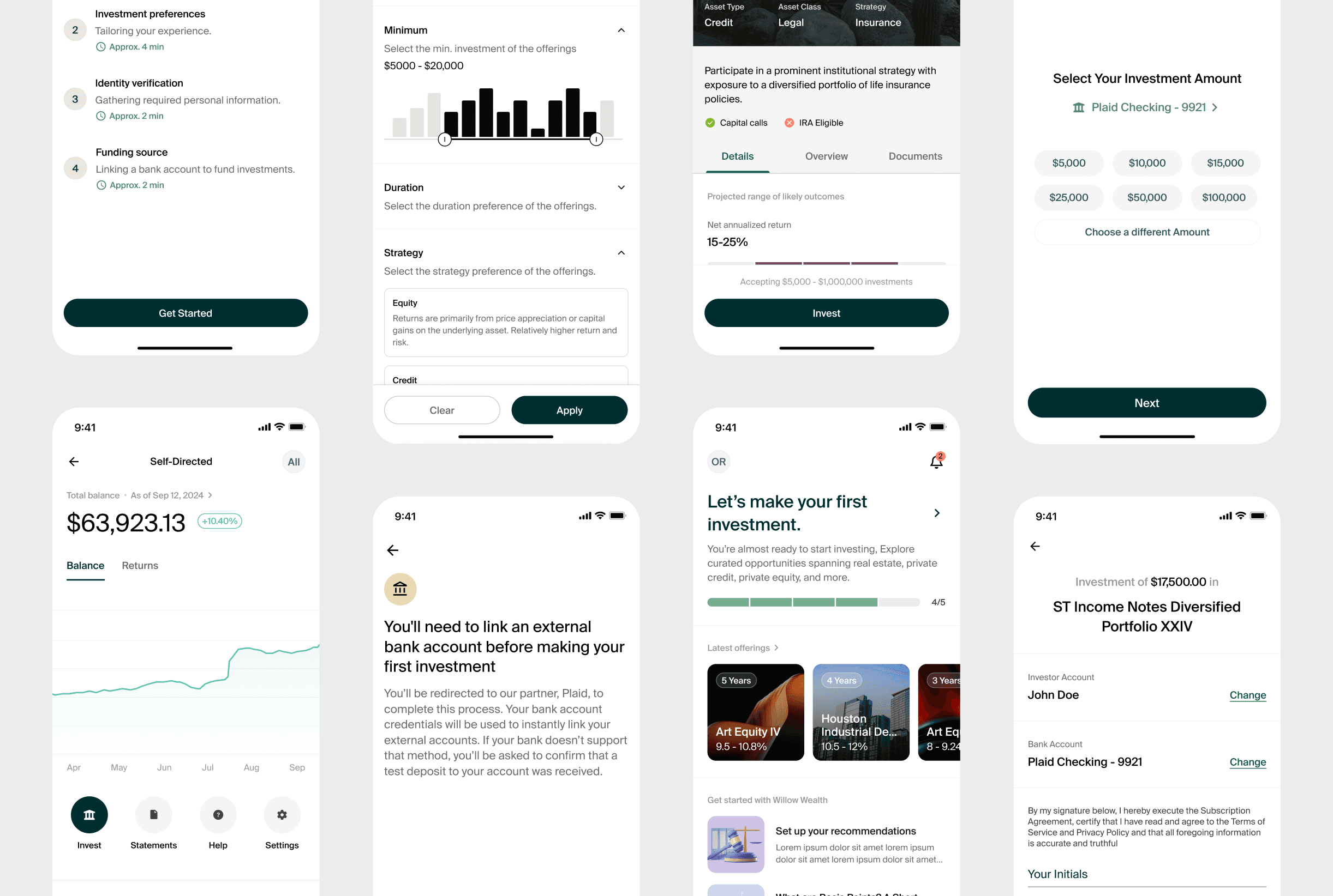
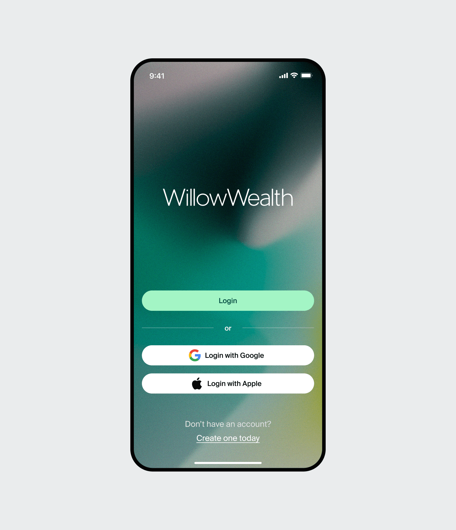
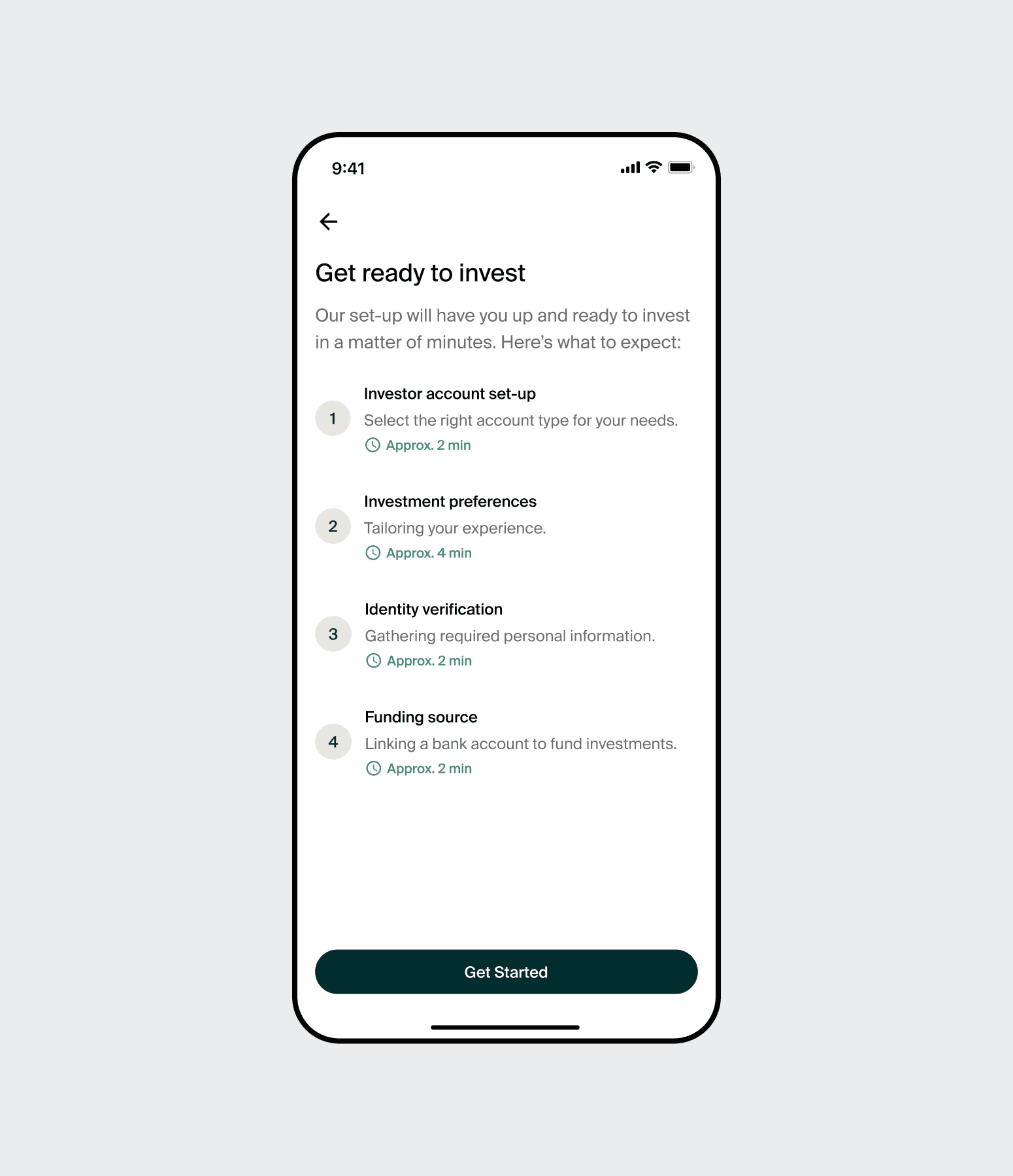
Onboarding
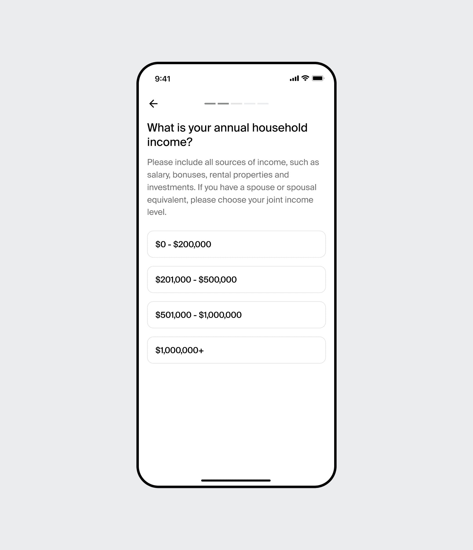
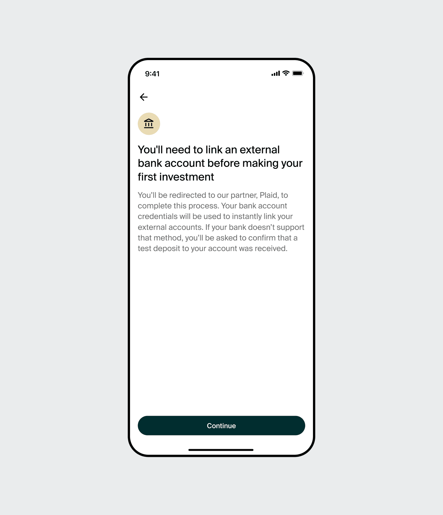
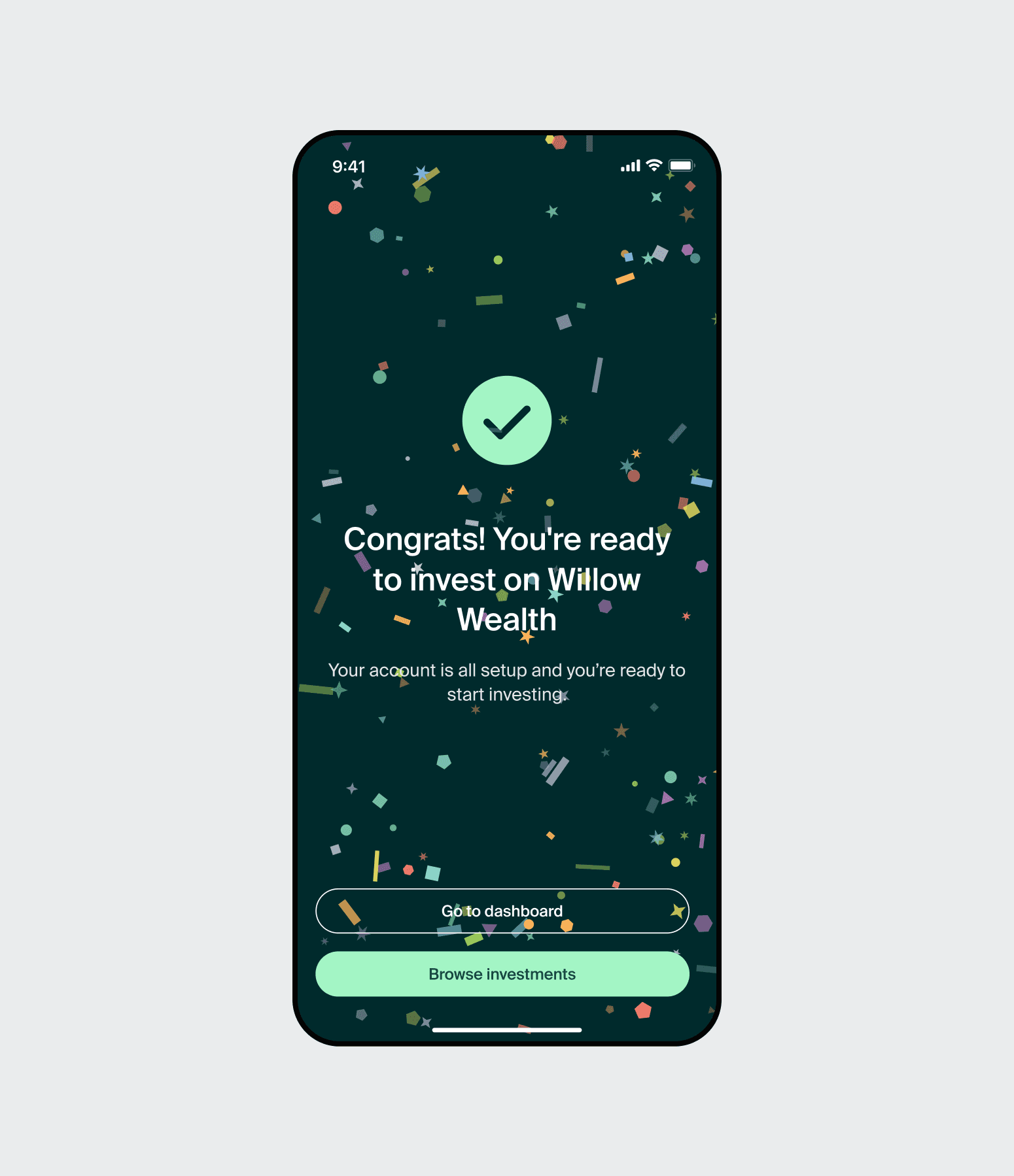
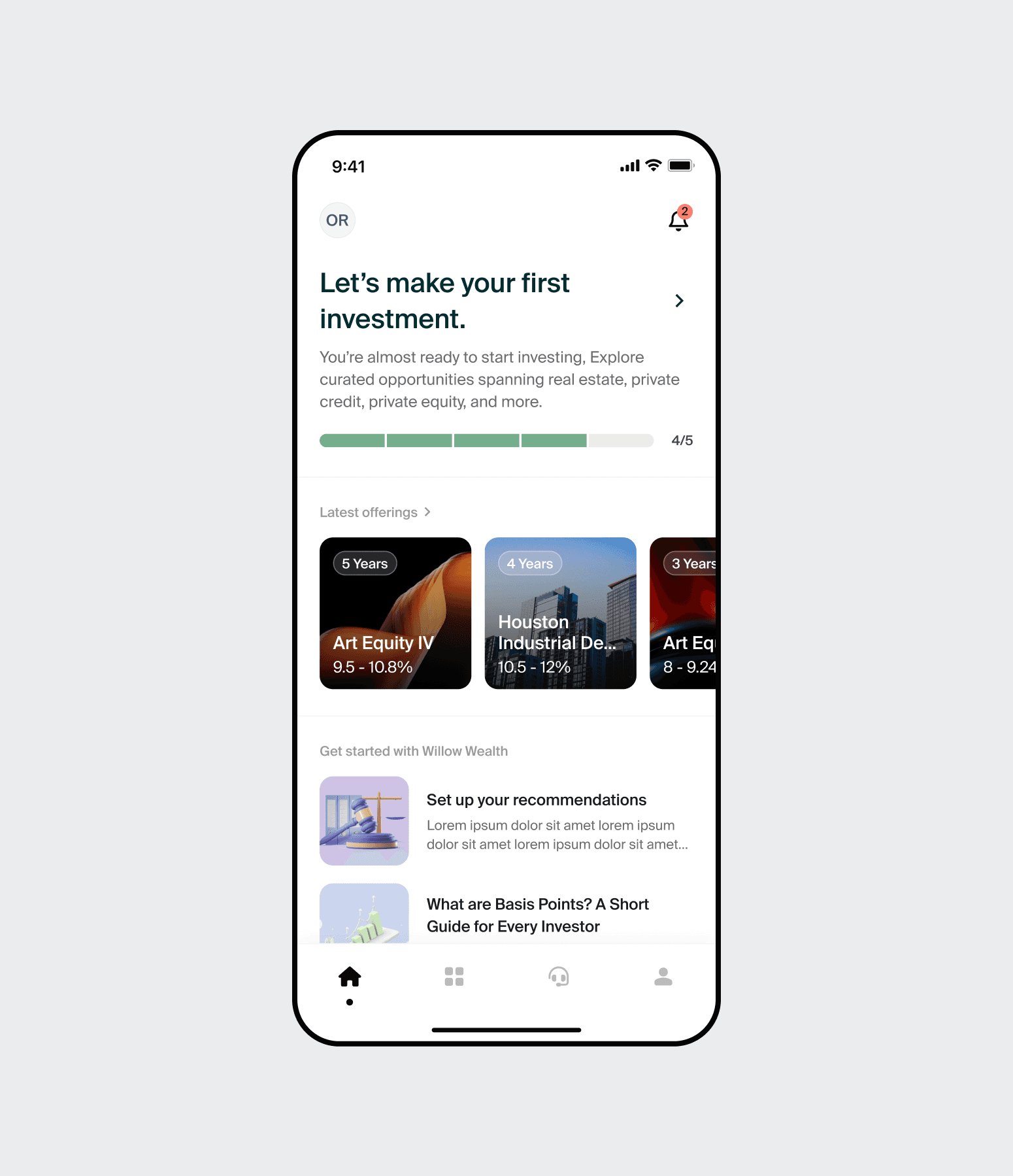
First impressions matter even more in finance, where trust is everything. The onboarding flow was rebuilt to close the visual gap between the app and the web platform immediately. Users now see a clear breakdown of the account creation steps and an estimated completion time upfront, which reduced drop-off. A persistent step indicator was added throughout, so users always know where they are. Complex legal and personal queries were broken into single-focus screens to reduce cognitive load. The post-signup experience was also redesigned: rather than a blank placeholder, new users land on an educational dashboard that introduces alternative assets and guides them toward their first investment.
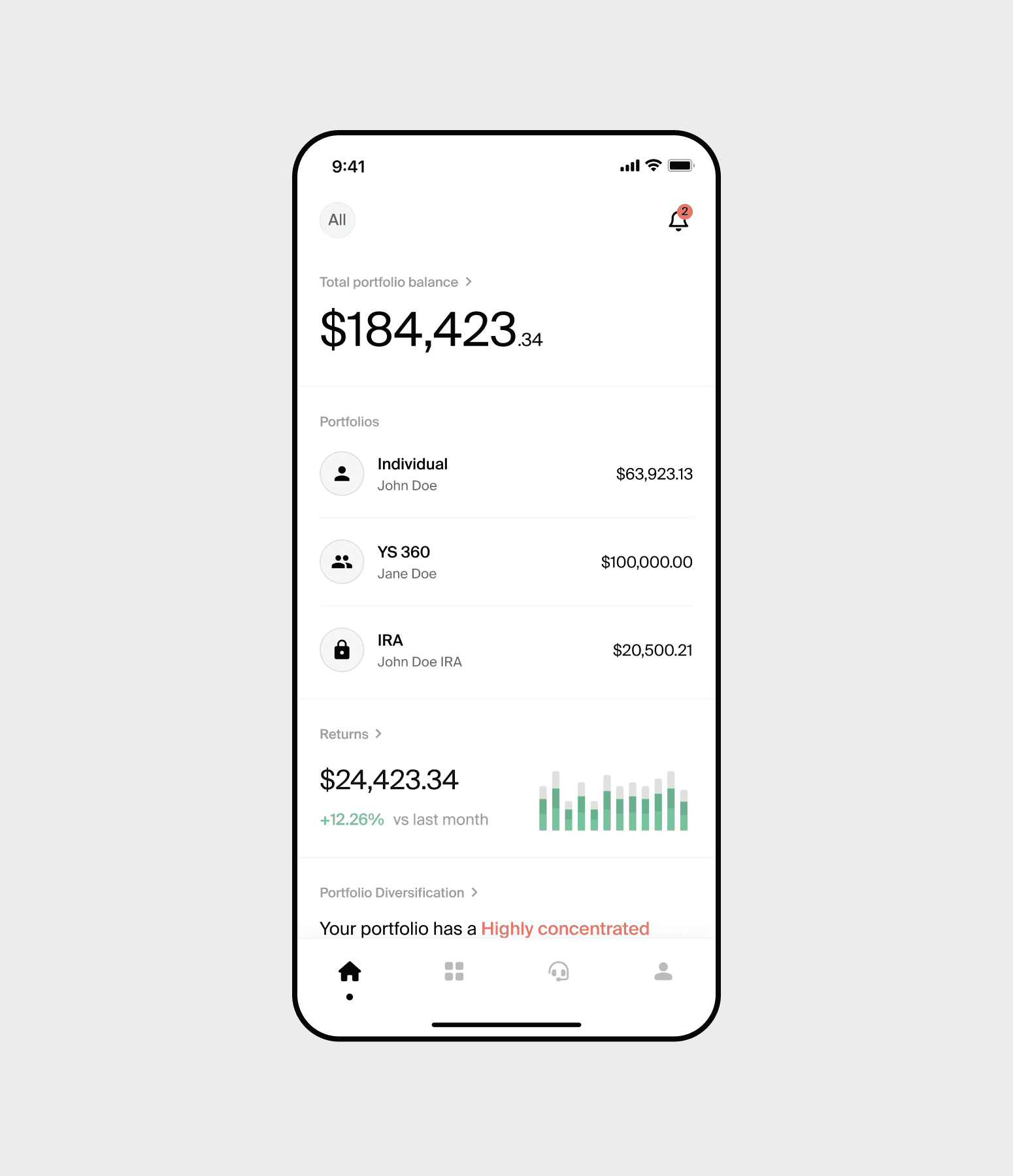
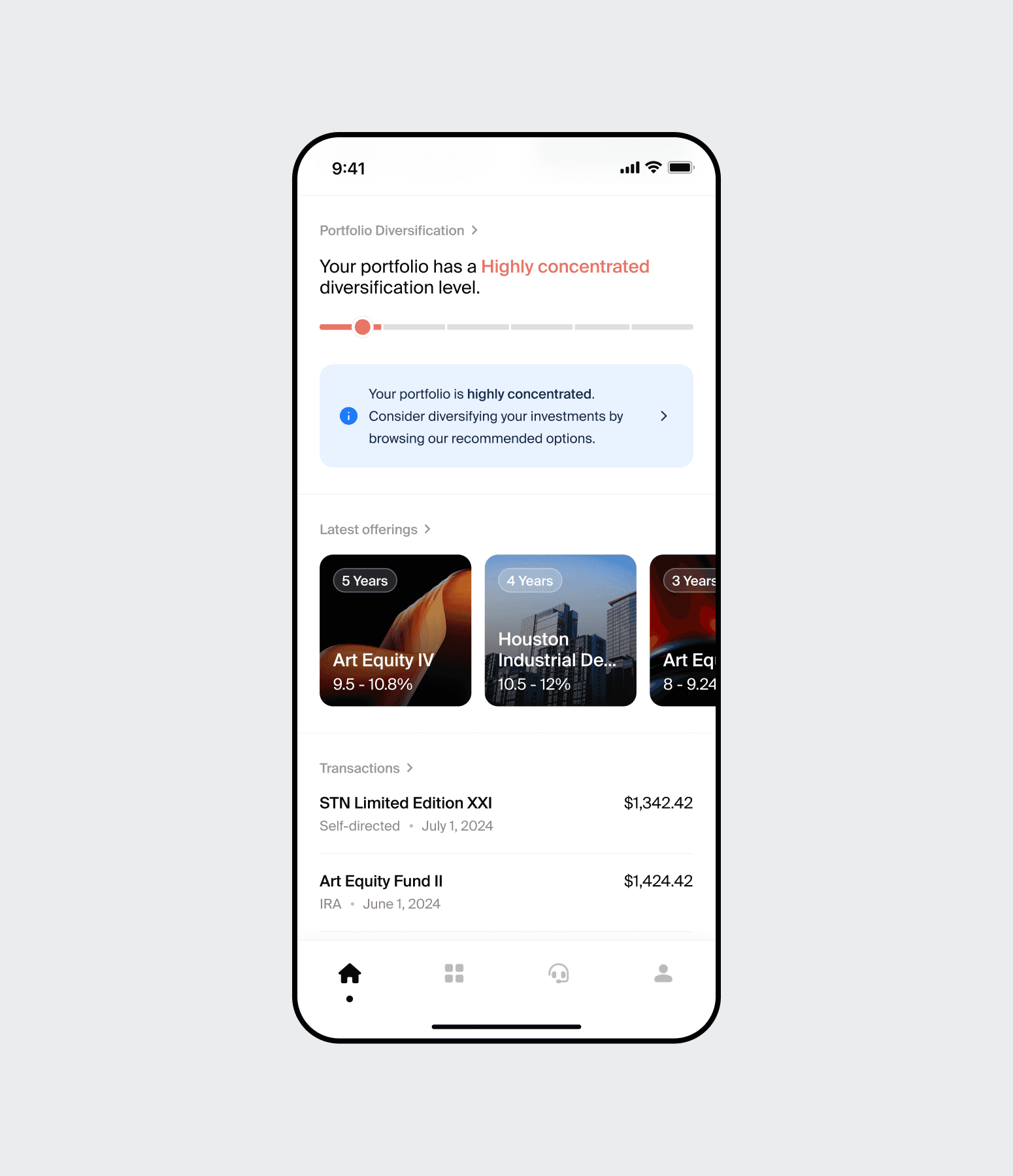
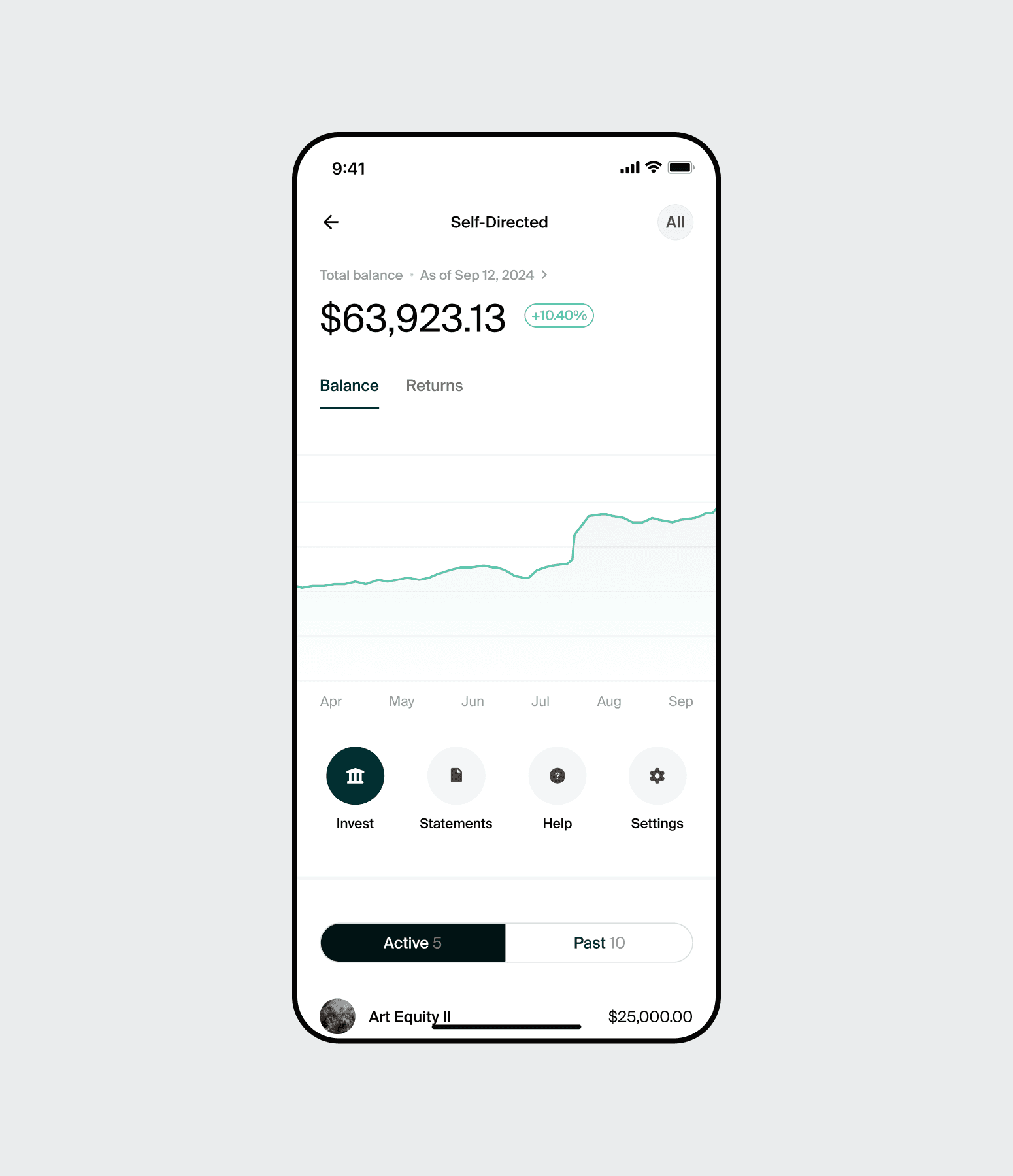
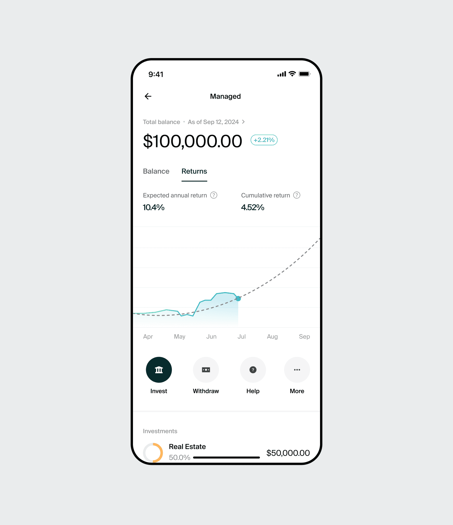
Portfolio Dashboard
Research confirmed that checking portfolio performance was the primary reason investors opened the app. The original design buried this data. The redesign restructured the information hierarchy entirely: Net Portfolio Value and Total Earnings were moved to the top of the screen with increased typographic prominence, so users can assess their position the moment they log in. Dense text lists were replaced with interactive charts for asset allocation and performance trends. Navigation was simplified to match the web dashboard logic, reducing the learning curve for users who switch between devices.

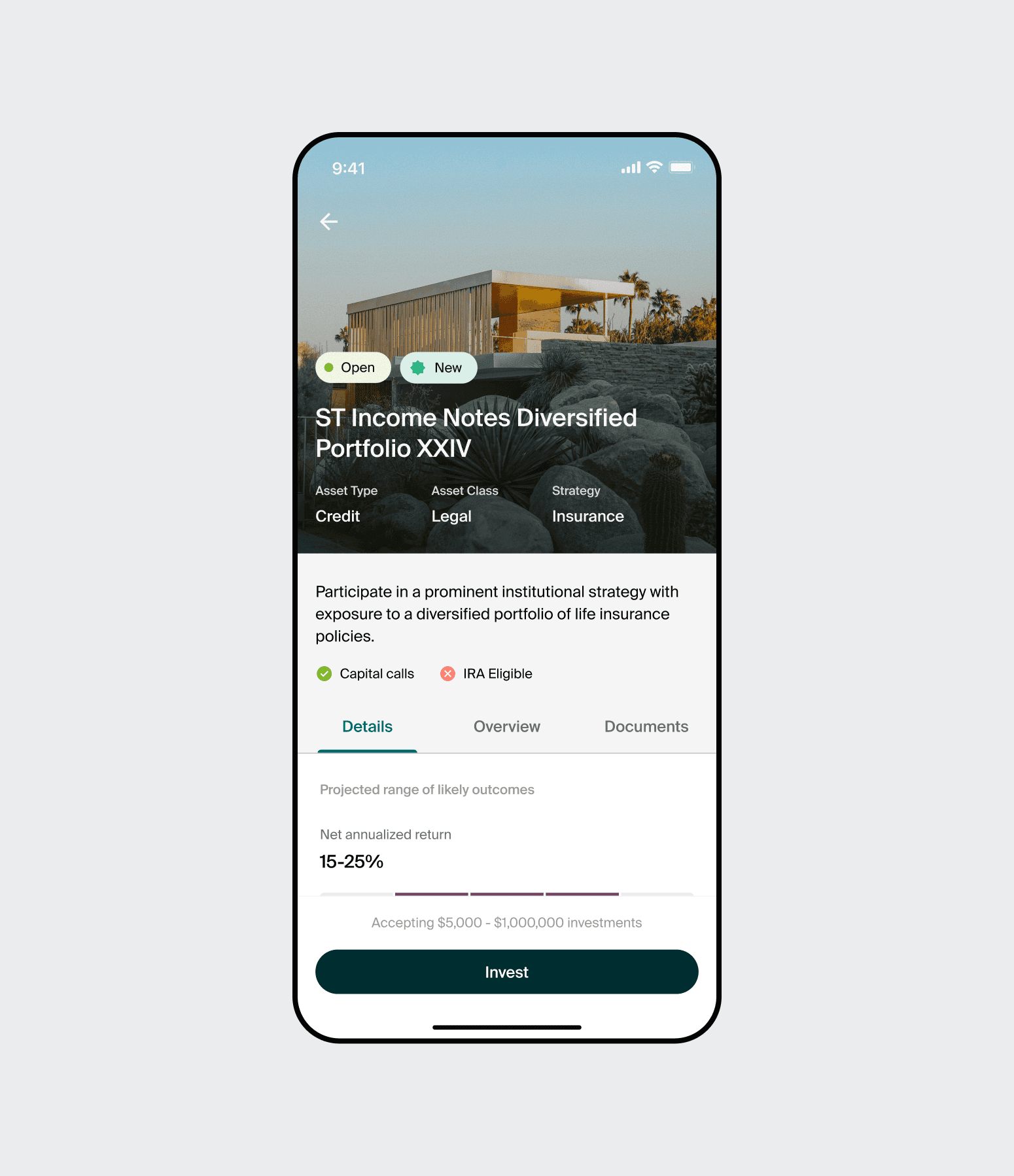
Investment Flow
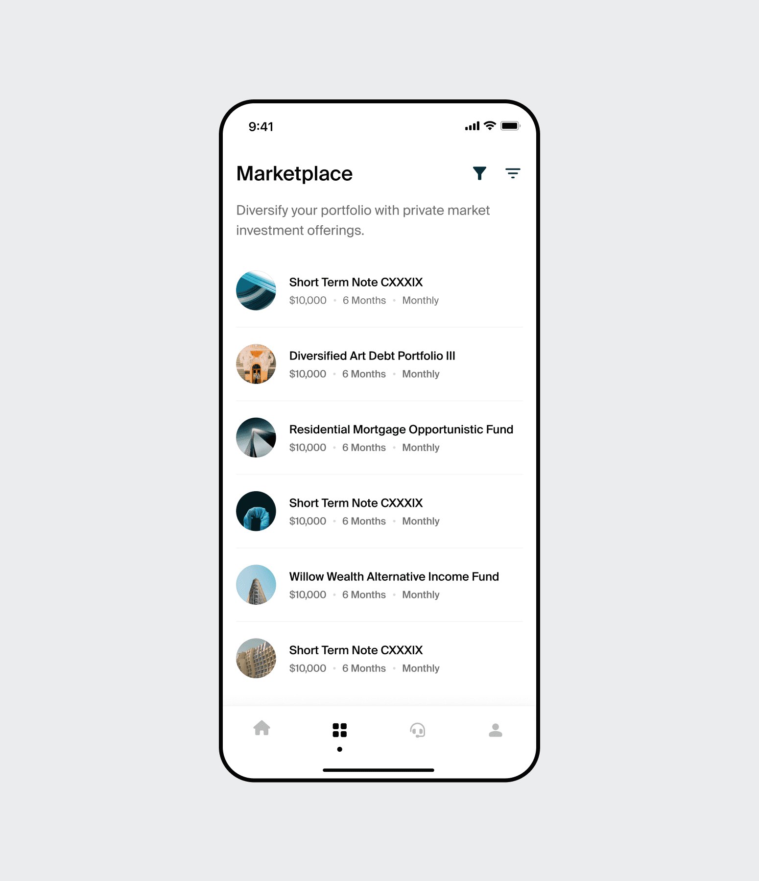
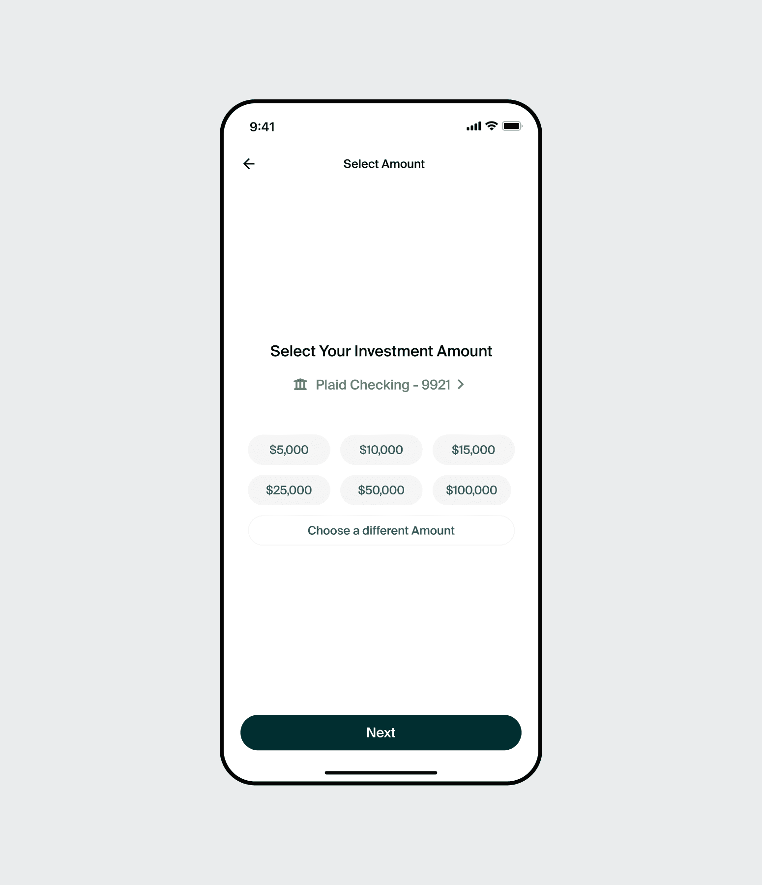
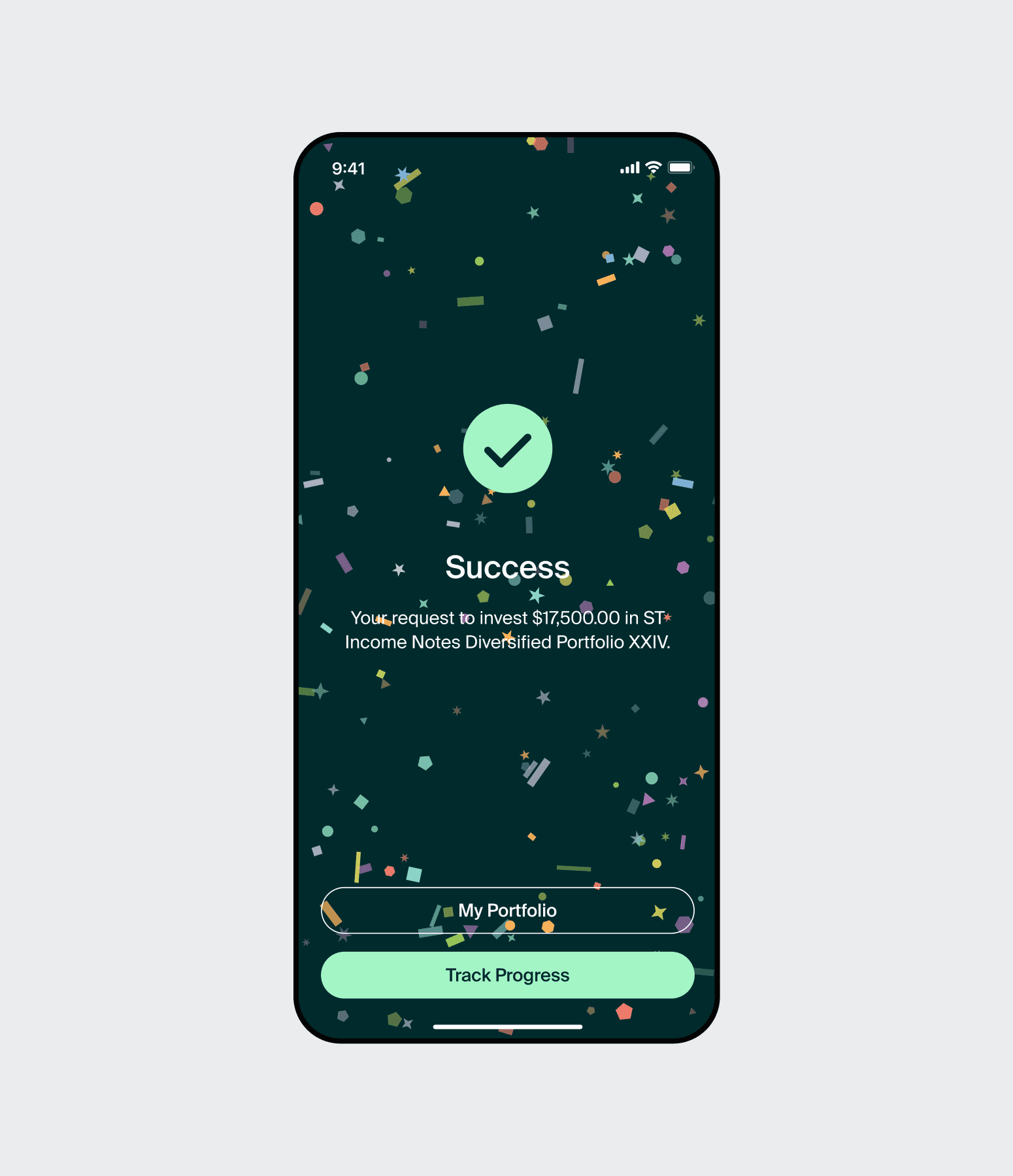
The investment funnel was the core revenue driver and the biggest source of mobile abandonment. Two changes drove the improvement. First, the offering page was redesigned to surface the metrics investors look for first: Net Annualised Return, Risk Rating, Term, and Distribution Schedule, all above the fold. Second, the checkout process was reduced from five steps to two. Reorganising the information layout cut unnecessary scrolling and lowered the interaction cost dramatically. Investors who were previously switching to the website to complete transactions were now finishing on mobile.

Impact
The redesign launched in May 2025. By rebuilding on a new framework and aligning the experience with the web platform, the mobile app became something investors chose to use, not just tolerated.
Highlights
78%
Boost in user engagement
Fixing the information hierarchy and adding visual data dashboards gave investors a reason to open the app daily, not just occasionally.
16%
Improvement in mobile app investments
Reducing the checkout from five steps to two, and surfacing key offering metrics upfront, removed the friction that was sending investors back to the website.
60s -> 1s
Big increase in app performance and quicker load times
The migration to React Native Paper eliminated the load time problem entirely. The single biggest barrier to frequent usage was gone.